Role: Graphic Designer
Target Audience: College Students
Skills: Web Design
What was the project?: I was tasked with choosing a website that had a bad user interface and ultimately fixing the problem that the site has. The problems that a bad interface can have is a bad layout, lack of use of brand esthetics, etc. In order to fix the problem I had to conduct a series of user tests, card sorting, wireframes, and many more.
What was the problem?: The problem with the original website is the arrangement of information was overwhelming for the viewer. Also, there was a lack of brand ascetics to the site, which made the site look very unpleasing.
What was the purpose of this project?: The purpose of this project was to get me in the habit of designing based off of user feedback on their experience of using a product.
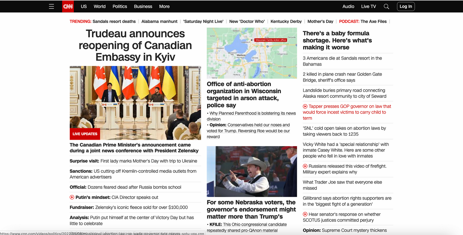
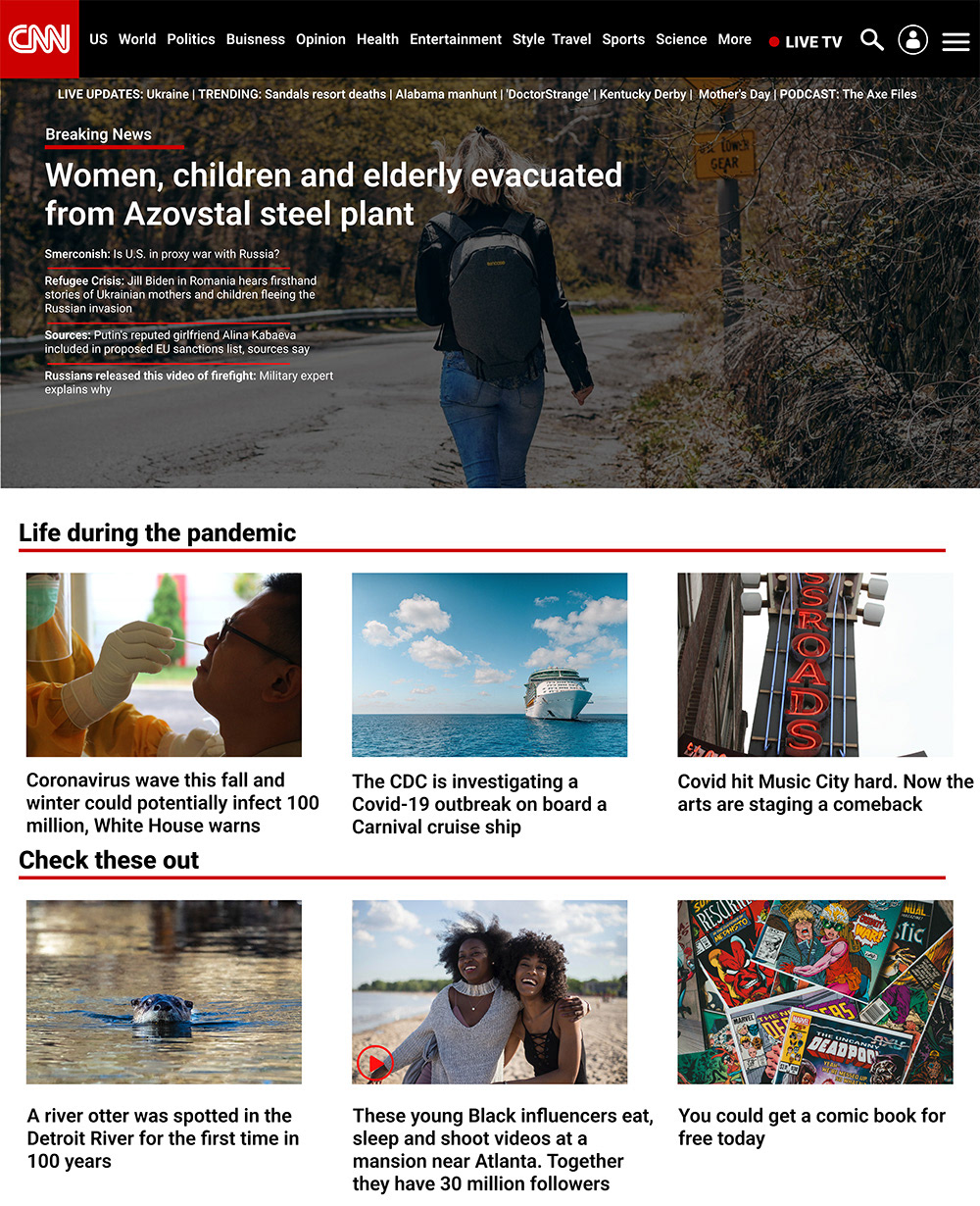
Original Home Page Layout
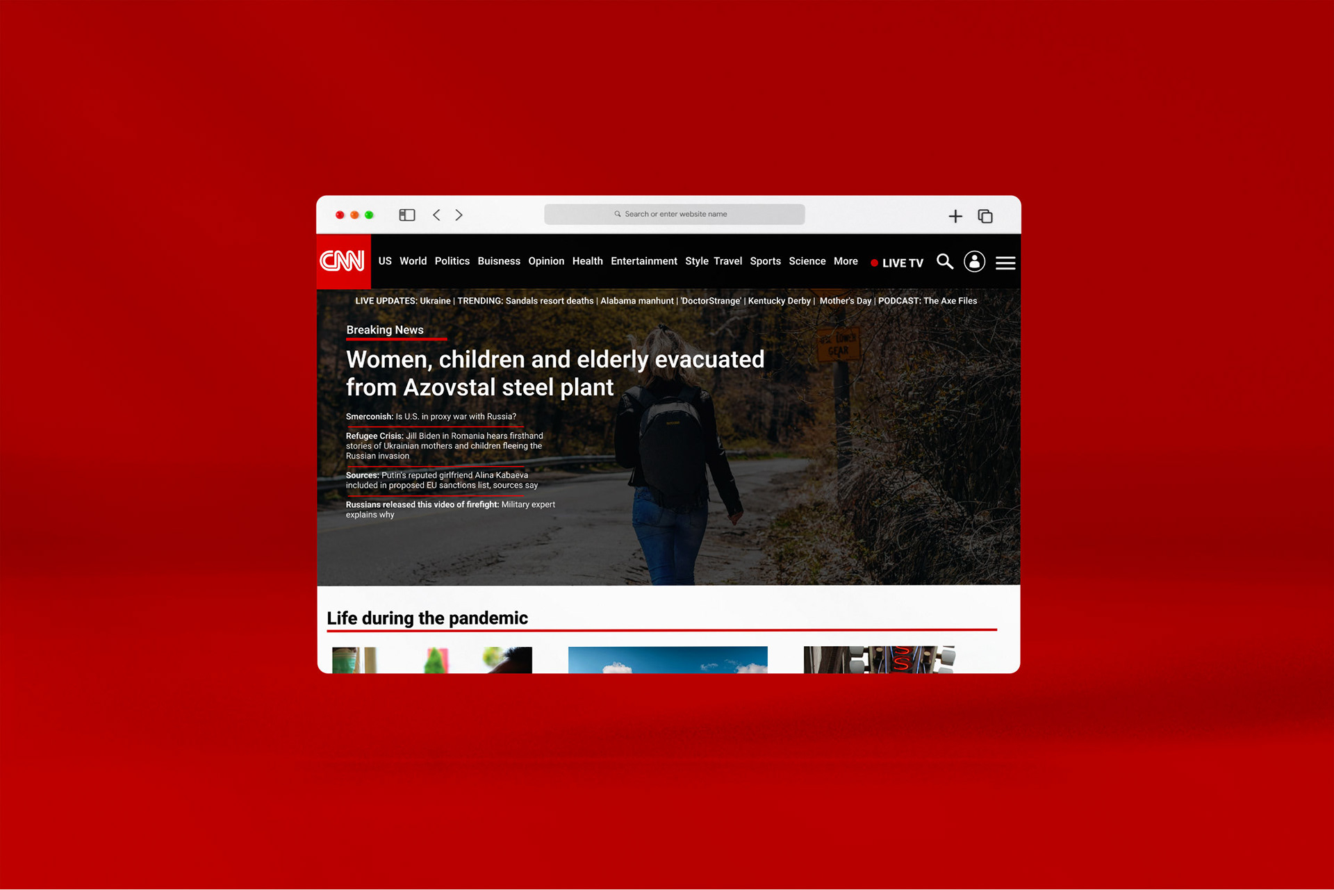
Home Page Redesign
For the home page, I really wanted to simplify the way that the information is laid out on the page so it can be easier for the person to read it. For the breaking news section, I made that information go on the top of the page, have an image in the background, and have the display text over the image so it can tell the viewer what is important. Then, below that, I have the rest of the information below it to separate the two sections.
Home Page
Home Page Mockup
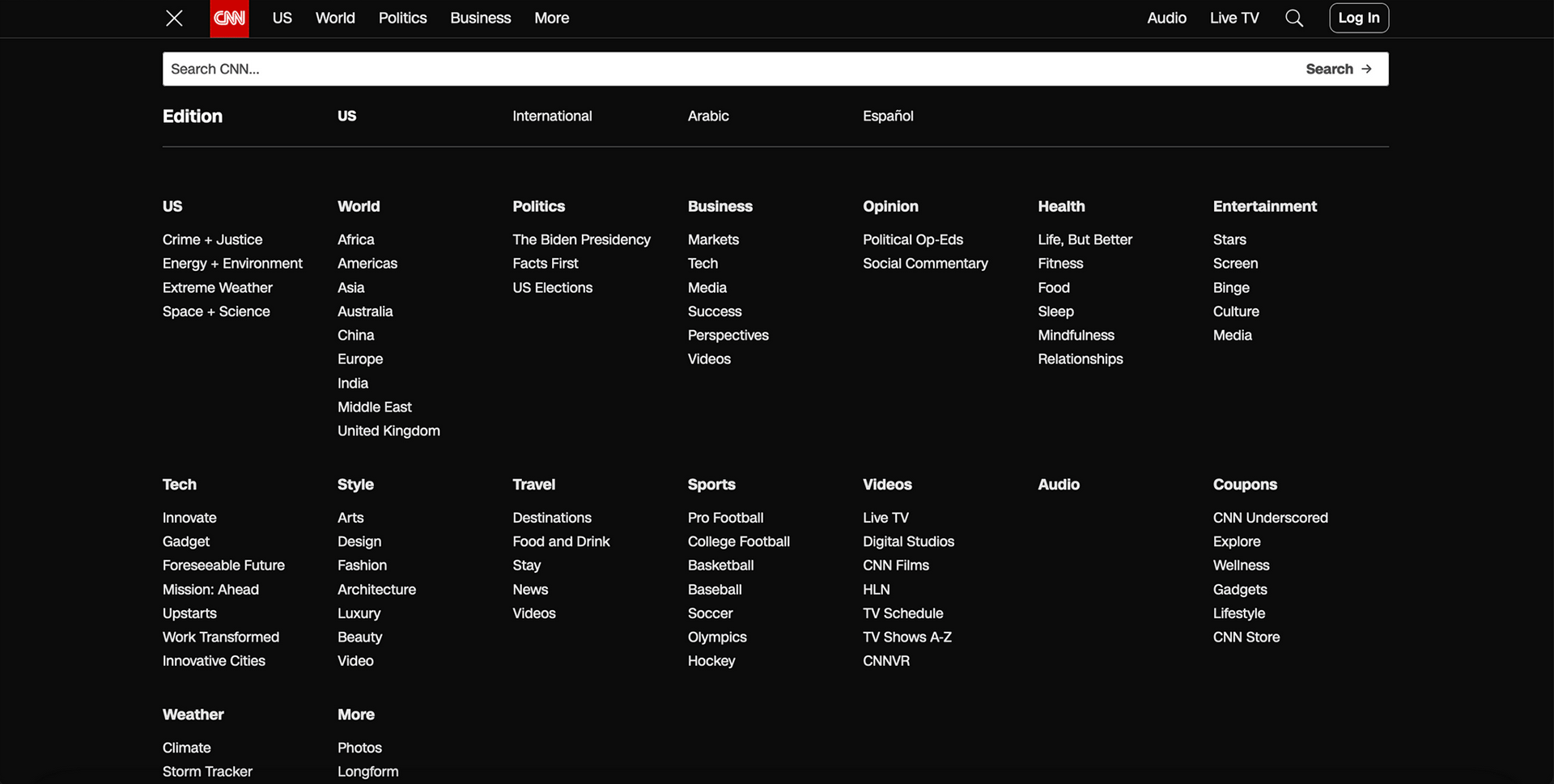
Original Drop down Menu
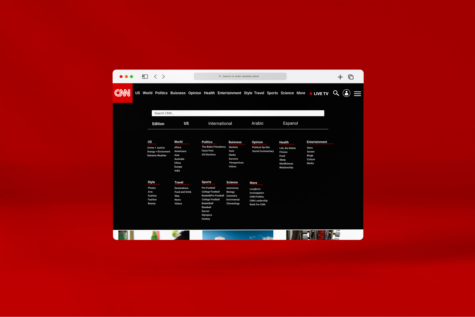
Drop down Menu Layout Redesign
Then moving on to the drop-down menu, I really wanted to add more brand aesthetics to it. The original drop-down menu really made it hard to distinguish the subheading from the normal text because of the white color of the type. To fix this problem I added a red line underneath the subheading to add more brand esthetics to the page and to better distinguish the subheading from the normal text.

Drop down Menu
Drop down Menu Mock up
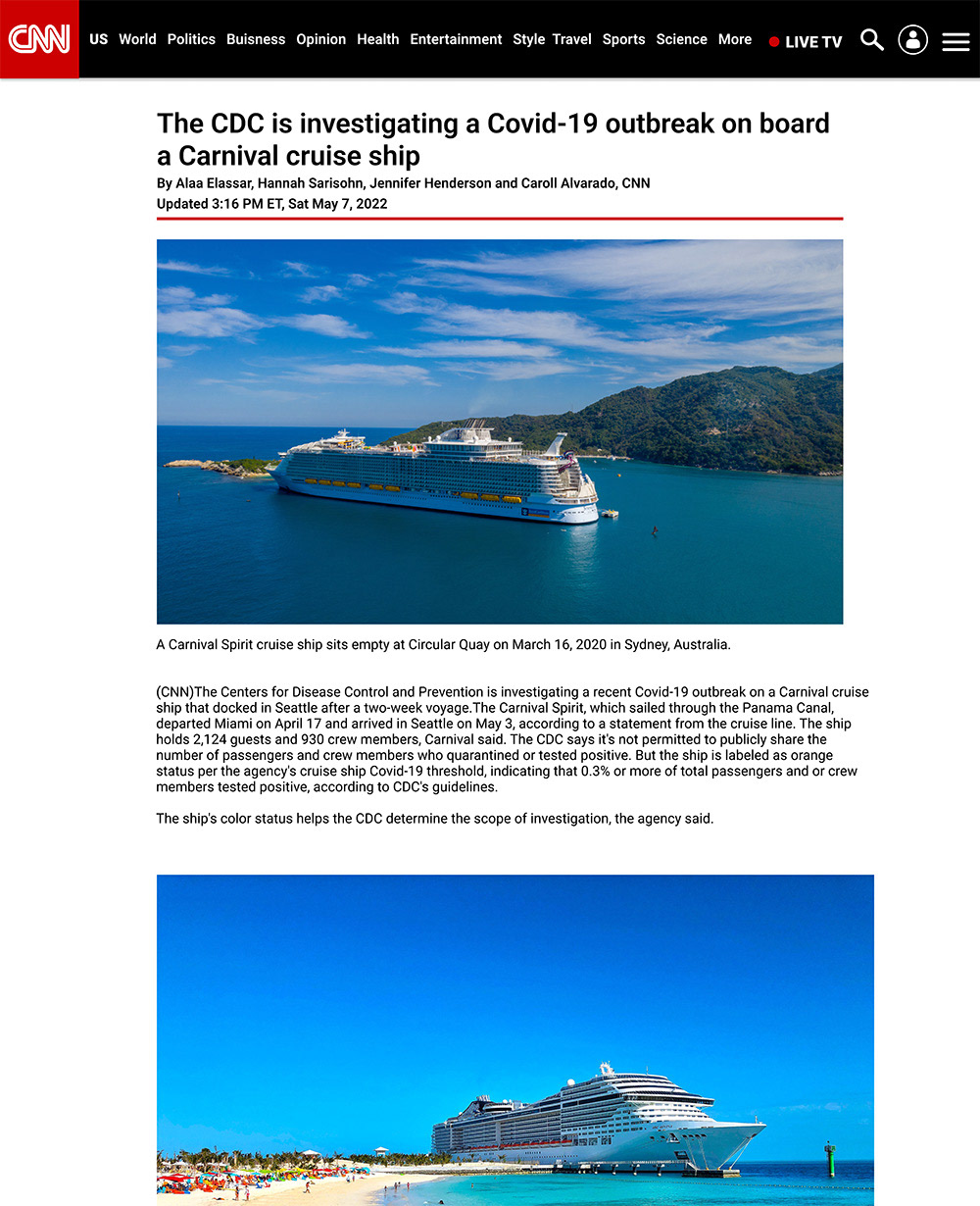
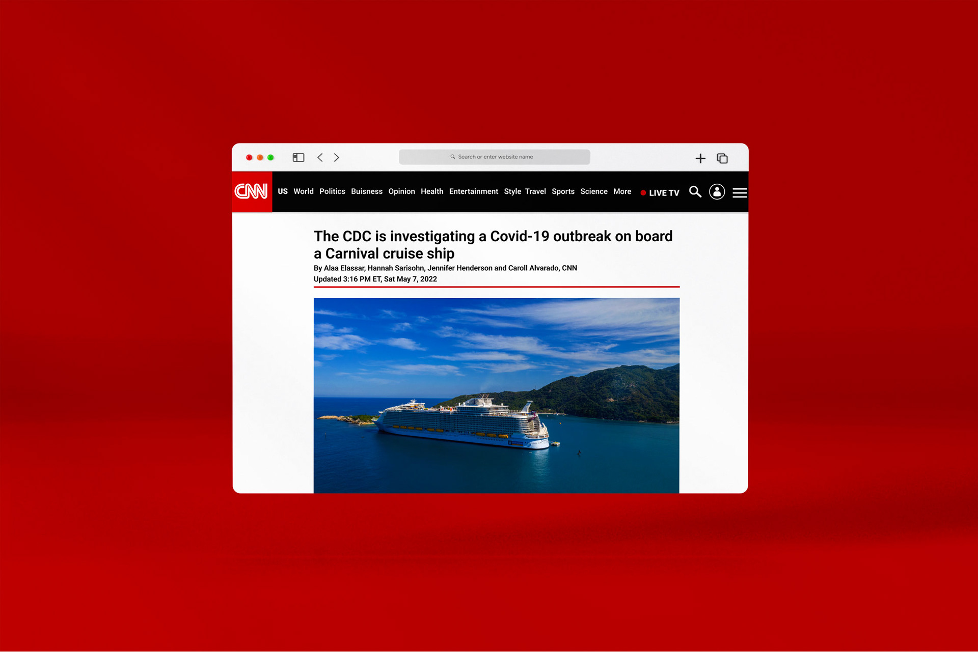
Covid-19 Article
If you go back to the home page and click on one of the articles relating to covid-19 it will take you to this page. There were really no major changes to this page, I just add a red line under the title information to utilize more brand esthetics.
Life during the pandemic article
Life during the pandemic article Mock up
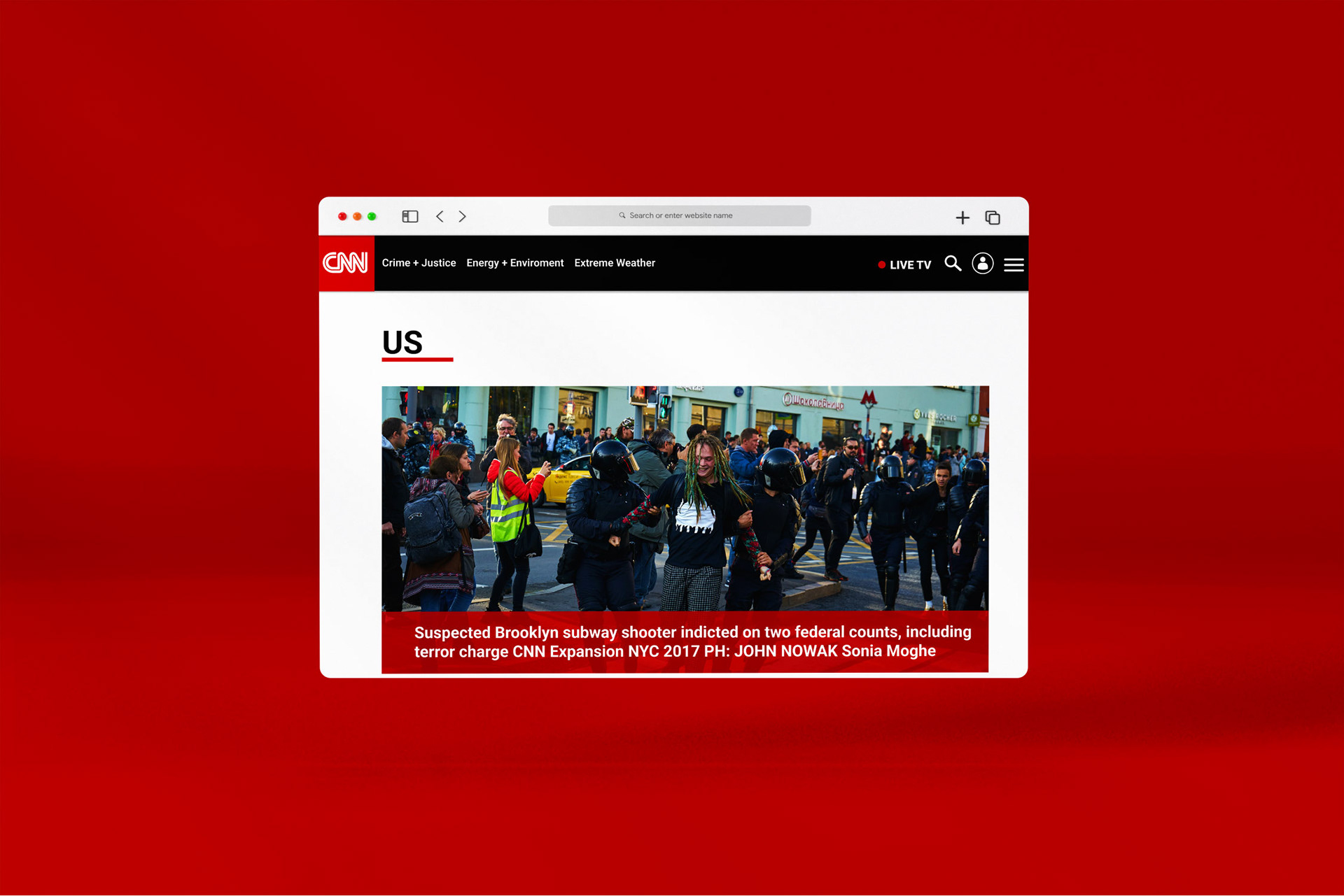
US Tab
Then if you click on the US tab in the drop-down it will take you to this page. The major thing I changed to this page is adding a red block, right along with adding some text to show that it is important. Then for the rest of the information on the bottom, I basically made it the same as the info on the bottom of the home page.

US Info
US Info Mock up